
In today’s digital age, accessibility isn’t just a nice-to-have feature—it’s a must. Whether your audience includes people with disabilities or just a diverse group of individuals with different preferences and needs, ensuring your email designs are accessible can significantly improve user experience and engagement. In fact, according to the World Health Organization, over 1 billion people live with some form of disability, which means a significant portion of your audience could be affected by accessibility issues if your emails aren’t properly designed.
So, how can you make your emails more inclusive and accessible? In this blog, we’ll dive into best practices for designing accessible emails that cater to everyone—regardless of their abilities.
Why Accessible Email Design Matters
Accessible email design ensures that all recipients, including those with visual, auditory, cognitive, or motor impairments, can easily understand and interact with your emails. It also aligns with inclusivity principles, showing that your brand values every customer. Aside from ethical considerations, there are practical benefits:
- Wider reach: By making your emails accessible, you ensure that people with disabilities can engage with your content, increasing your potential reach.
- Improved user experience: Accessible emails enhance the overall experience for all users, not just those with disabilities.
- Better compliance: With more governments and organizations pushing for digital accessibility laws and standards (such as the Americans with Disabilities Act in the U.S.), ensuring your emails are accessible can help you stay compliant and avoid potential legal issues.
1. Use Descriptive Alt Text for Images
Many email clients don’t automatically load images, and some email recipients may rely on screen readers to read emails aloud. For those reasons, adding descriptive alt text to images is a crucial step in making your emails accessible.
Best practices:
- Always include alt text for all images, from logos to product photos.
- Keep the description clear and concise, focusing on the content and purpose of the image. For example, instead of “Image of a dog,” say “Black Labrador sitting on a beach.”
- Avoid redundant phrases like “image of” or “picture of” since screen readers will already announce that it’s an image.
2. Ensure Sufficient Color Contrast
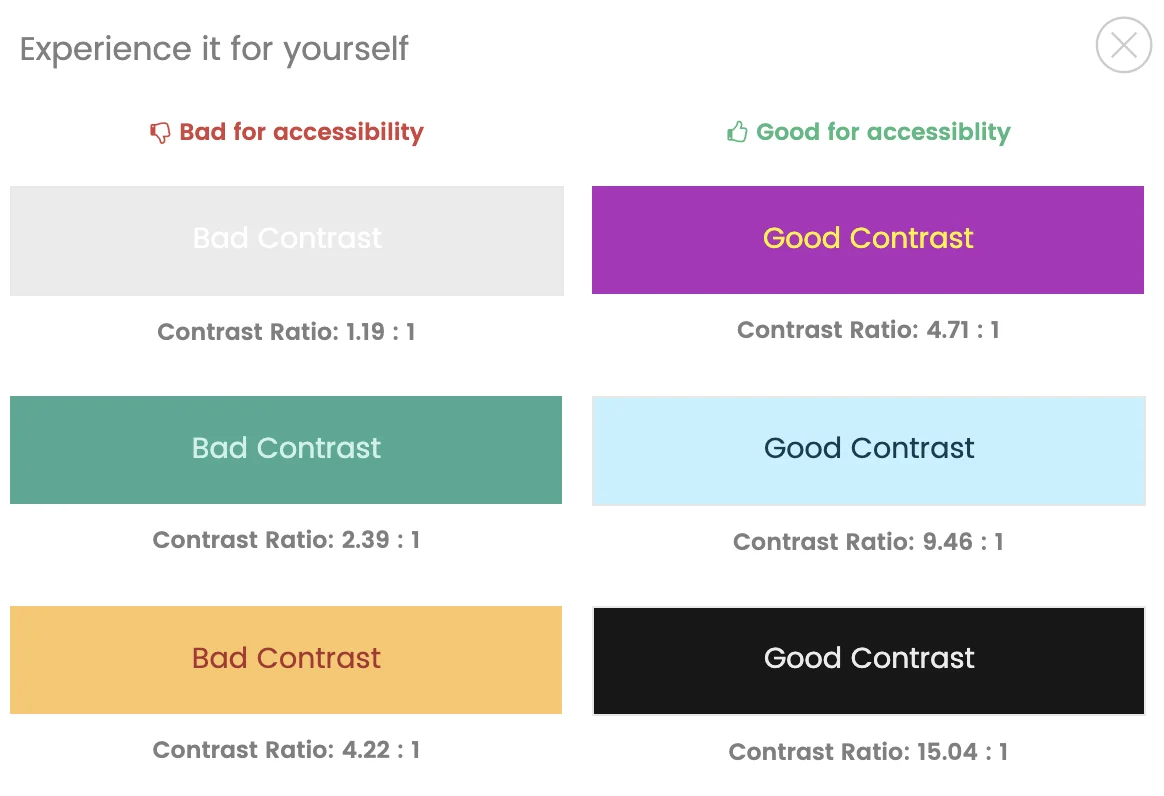
Color is an essential part of your email’s visual design, but it can also be a barrier if not used thoughtfully. People with color blindness, visual impairments, or low vision may struggle to read text or see important elements if there’s not enough contrast.
Best practices:
- Use high contrast between text and background colors. A good rule of thumb is to ensure a contrast ratio of at least 4.5:1 for regular text and 3:1 for large text (according to WCAG 2.1 guidelines).
- Avoid relying solely on color to convey important information. For example, instead of just saying “Click the red button,” you could say “Click the red button labeled ‘Shop Now’.”
- Test your color choices using online tools like the WebAIM Color Contrast Checker to ensure readability.
3. Use Simple, Clear Fonts
Font choices can dramatically impact accessibility. People with visual impairments or cognitive disabilities may find it difficult to read text that is too small, too ornate, or difficult to decipher.
Best practices:
- Stick with clean, sans-serif fonts like Arial, Helvetica, or Verdana. These fonts are generally easier to read for people with dyslexia or other reading challenges.
- Ensure that the font size is large enough for easy reading, especially on mobile devices. Aim for a minimum of 14px for body text and 22px for headings.
- Use bold or italics sparingly and only for emphasis. Overuse can make text harder to read.
4. Structure Your Email with Clear Headings and Lists
Organizing your email with clear headings, subheadings, and bullet points helps readers easily navigate and understand your content. This is particularly beneficial for people using screen readers, as these tools can jump from heading to heading or list to list.
Best practices:
- Use semantic HTML (headings, lists, paragraphs) to structure your email properly. This ensures that screen readers can identify and navigate through sections of your email.
- Use headings (H1, H2, H3) to break up your content into digestible sections. For example, instead of a long paragraph of text, break it into sections with relevant headings.
- Bullet points and numbered lists are helpful for presenting information in a digestible format, making it easier for both screen readers and sighted readers to follow.
5. Make Links Descriptive and Easy to Find
Links are an integral part of most email designs, but poorly formatted or vague links can be frustrating for users, especially those relying on screen readers or keyboard navigation.
Best practices:
- Make sure all links are descriptive and tell users where they’ll be taken. Instead of using generic phrases like "Click here" or "Learn more," use specific calls to action, like “Shop our latest collection” or “Read the full blog post.”
- Use a larger clickable area for links, buttons, and calls to action, ensuring they are easy to click, especially for users with motor impairments.
- Test all links to ensure they’re functional and lead to the correct pages. Broken links can create barriers for users, especially those with cognitive disabilities.
6. Add Text-Based Alternatives for Interactive Elements
Interactive elements, such as hover effects, carousels, or embedded videos, can be challenging for users who rely on assistive technologies like screen readers or keyboard navigation.
Best practices:
- If you use hover effects, make sure they are also accessible by keyboard or other means. For example, if a button changes color or position when hovered over, ensure that the same effect happens when the element is focused with the keyboard (using the “Tab” key).
- Provide text alternatives for interactive elements. For example, if you include a carousel, provide arrows or pagination controls that can be navigated with a keyboard or screen reader.
- For embedded videos, always provide captions or transcripts to accommodate users who are deaf or hard of hearing.
7. Test Your Emails for Accessibility
Once you’ve implemented accessibility best practices, it’s important to test your emails to ensure they work as expected across different platforms and devices. Accessibility tools can help identify potential issues before you hit send.
Best practices:
- Use tools like WAVE, Axe, or MailChimp’s accessibility checker to evaluate the accessibility of your email designs.
- Test your emails across different screen readers, devices, and email clients to see how they perform in various environments.
- Solicit feedback from users with disabilities to ensure your emails meet their needs and expectations.
Making Accessibility a Priority
Creating accessible email designs is more than just a technical requirement—it’s about ensuring that everyone, regardless of their abilities, can access and engage with your content. By following these best practices, you can make your emails more inclusive, improve user experience, and expand your reach to a wider audience.


